It has been about 1 year since the big UI re-write of SCM in 2024.
Here is looking back at some of the changes from back then and now.
Different UI theme
SCM 2024
SCM 2025
Slightly less colorful buttons. Non essential commands pushed into menus for a cleaner look.
Dark theme comparison
For color choice, SCM 2025 keeps closely to colors from the Nord UI palette for better matching colors.
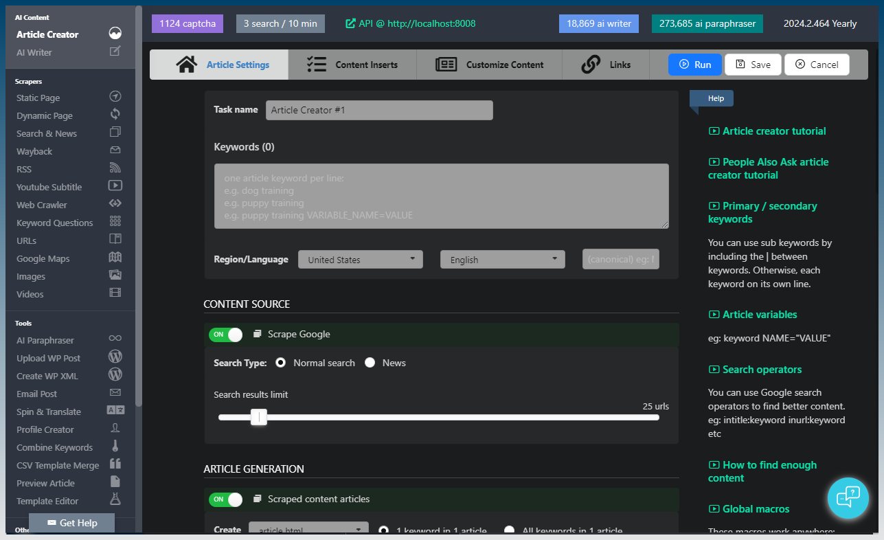
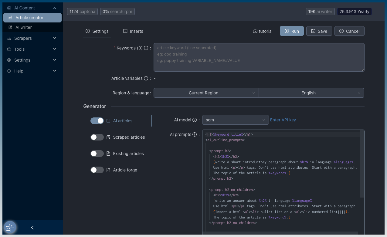
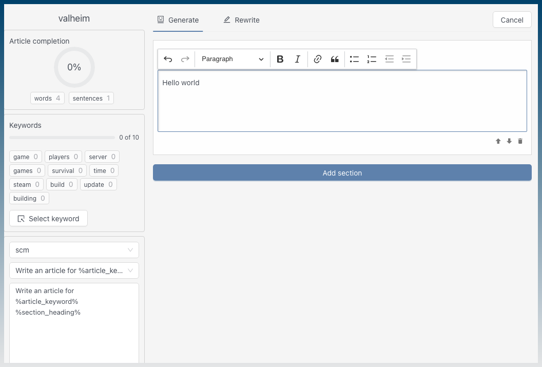
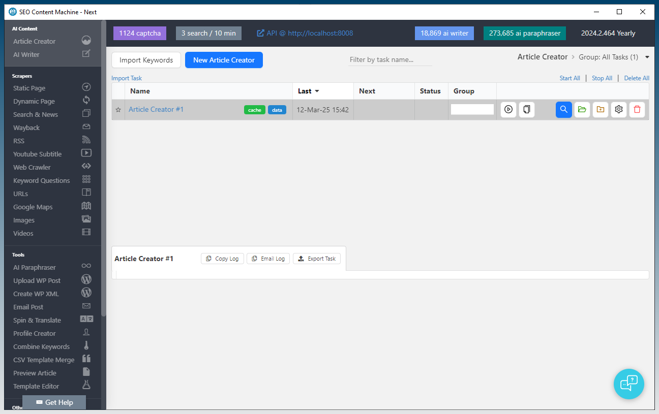
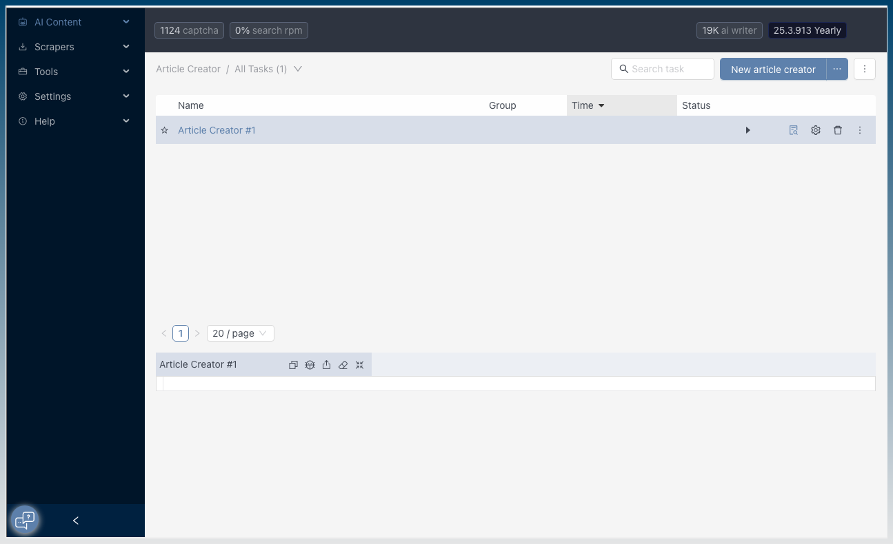
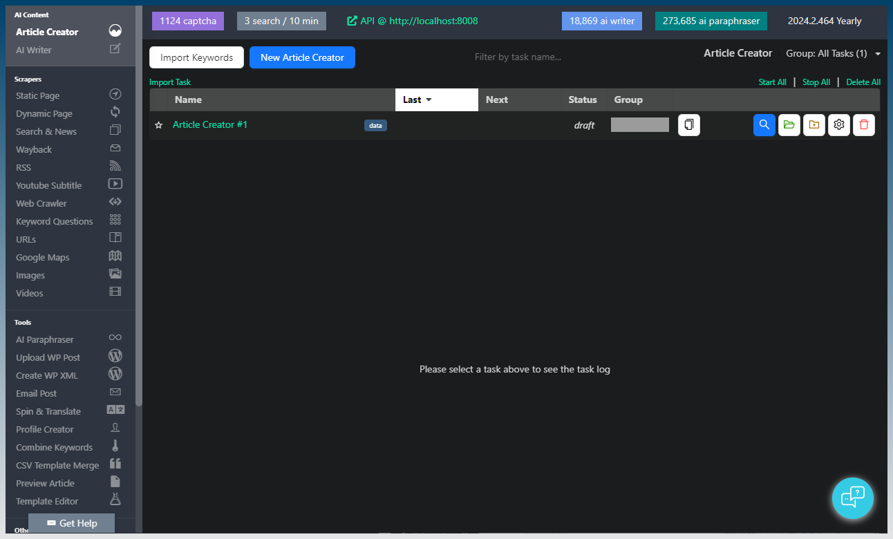
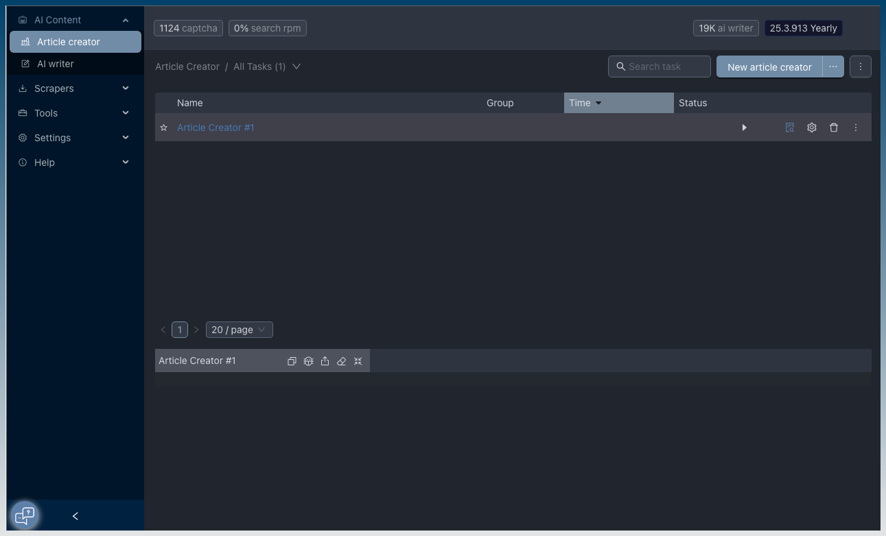
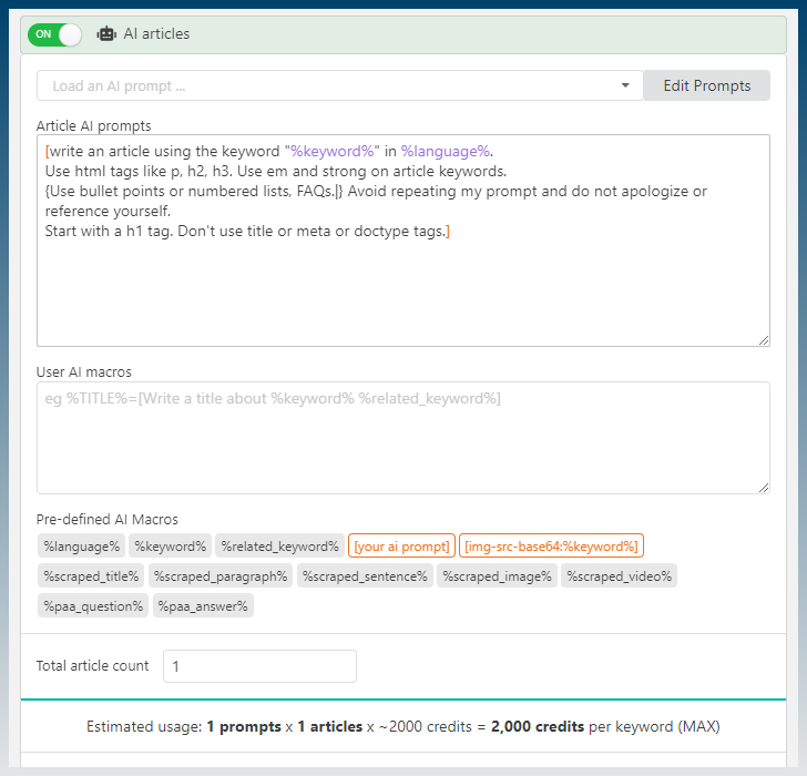
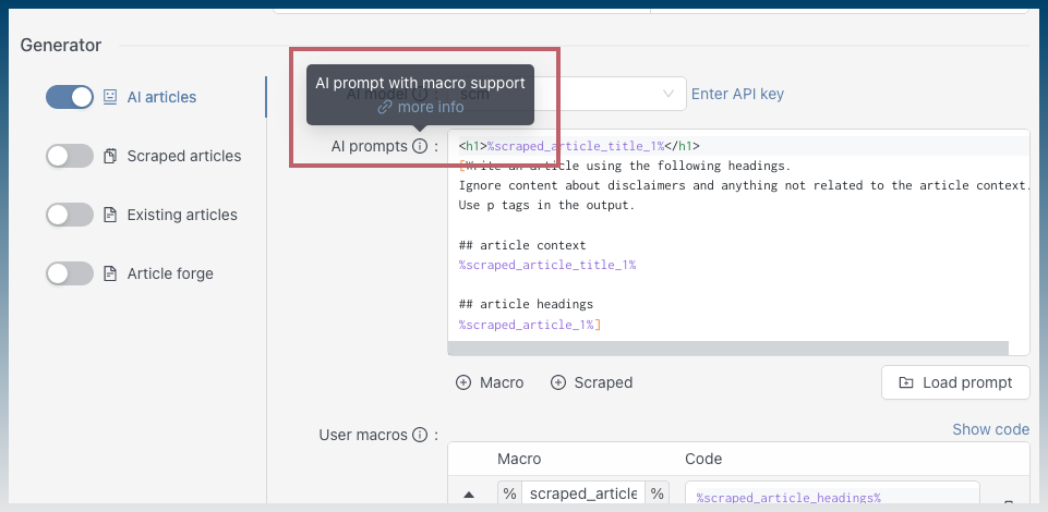
Article creator
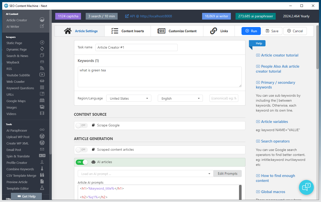
Better UX. Generator selectors all visible in one screen. No need to scroll. More obvious what you are using.
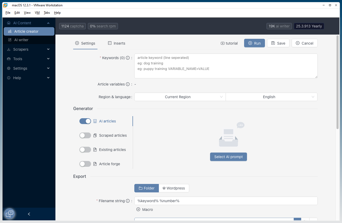
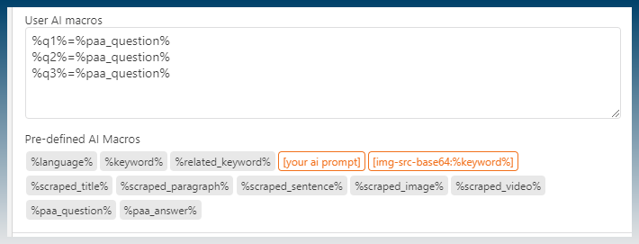
Macros are tucked away into menus now.
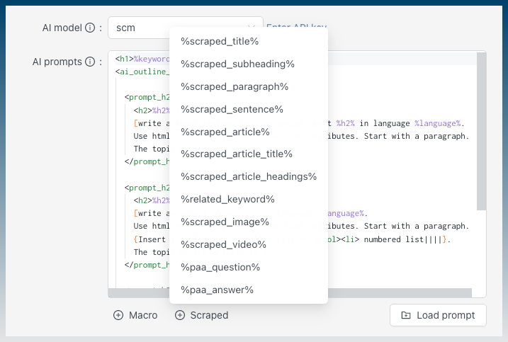
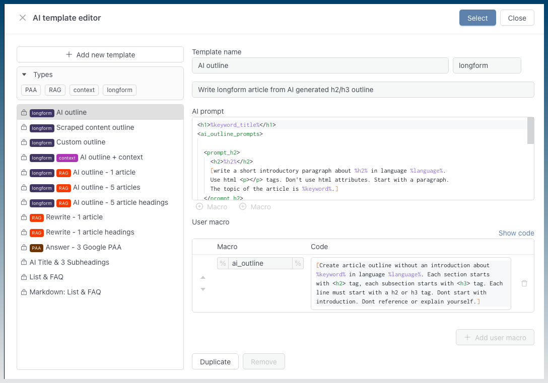
Improved AI template editor with more default templates that make use of all available macros.
Improved macro highlighting including lines for marking tabs.

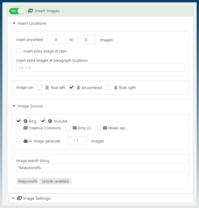
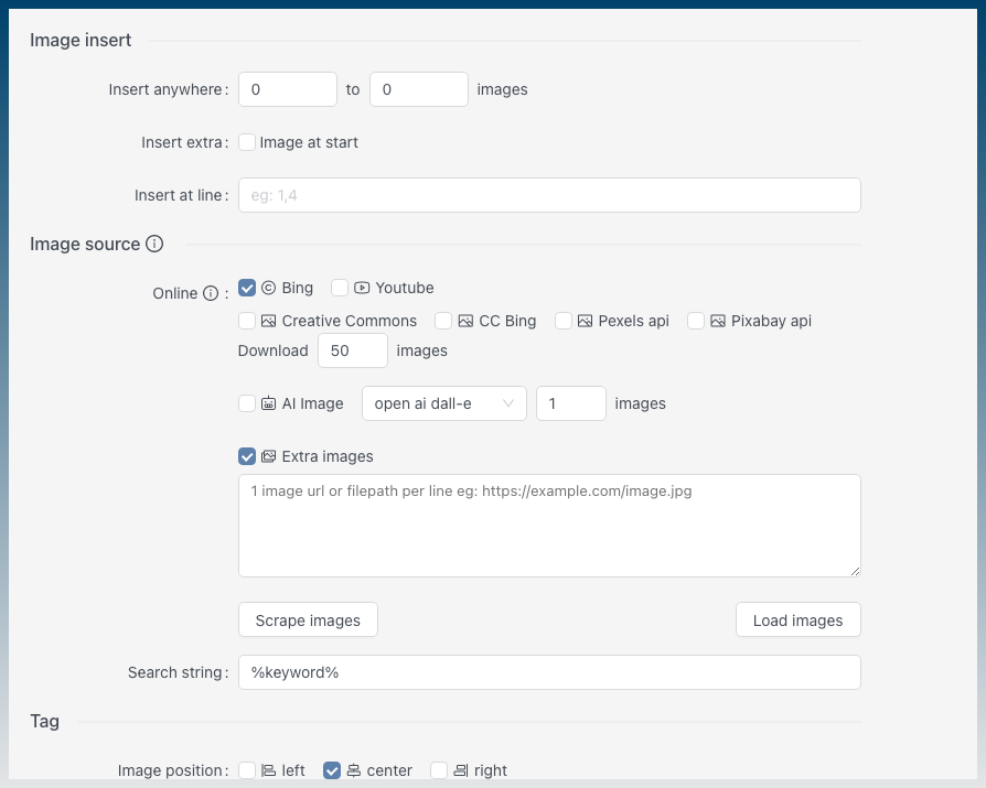
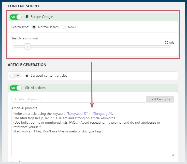
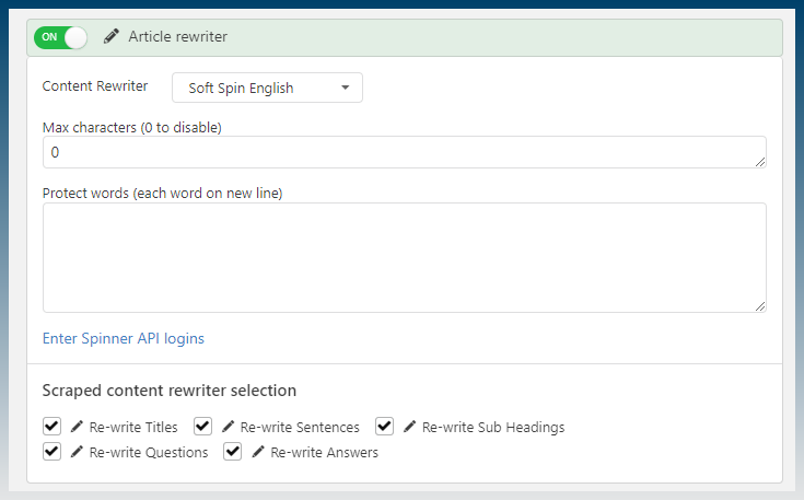
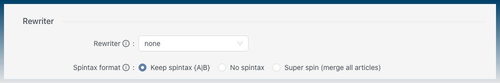
Streamlined content inserts.
There is one list with toggles, instead of both TOC and scroll-able collapsed boxes.
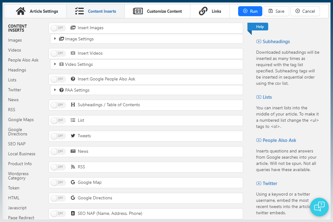
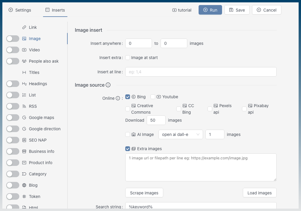
Extra thought put into streamlining the insert options. You can now choose the AI image model.
The excessive nav buttons have been reduced from 4 steps, to only 2.
![]()

Using RAG AI templates will warn you about selecting a content source.
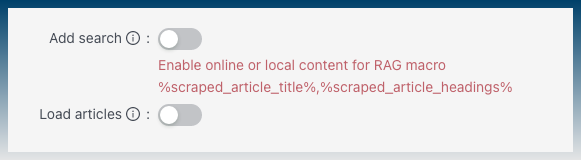
Before you had to know that this search box setting also affects the AI stuff.
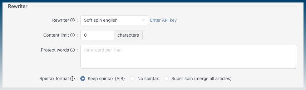
You don’t need to turn on a spinner to select it.
Only until you select a spinner,will it show options.
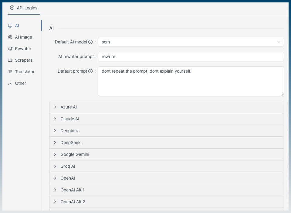
Settings menu
The settings menu wasn’t categorized.
With the total explosion of new AI services, api logins now has categories as well.

More UI tips
Before
Added UI tips and links to tutorials next to labels.
Now you can hover over info icons and even get links to extra tutorials.
AI Writer
Before
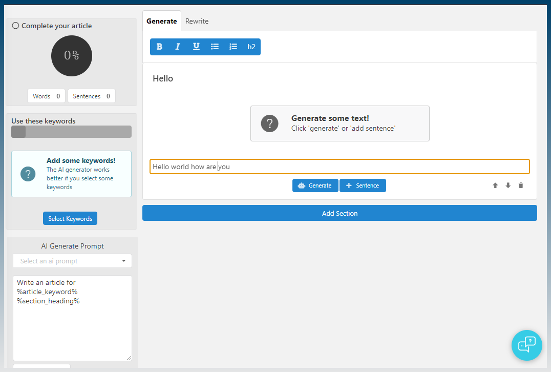
Added proper text editor (that includes RTL support)
Inline format menu for text