SCM is getting a big UI/UX re-work
The goals are:
- Modernize UI
- Streamline UX (ie less clicks)
SCM is getting a big UI/UX re-work
The goals are:
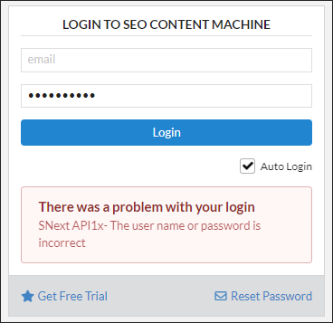
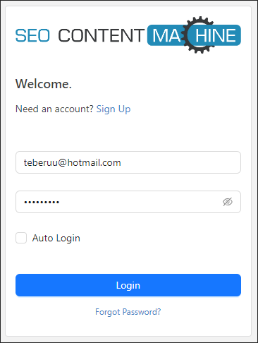
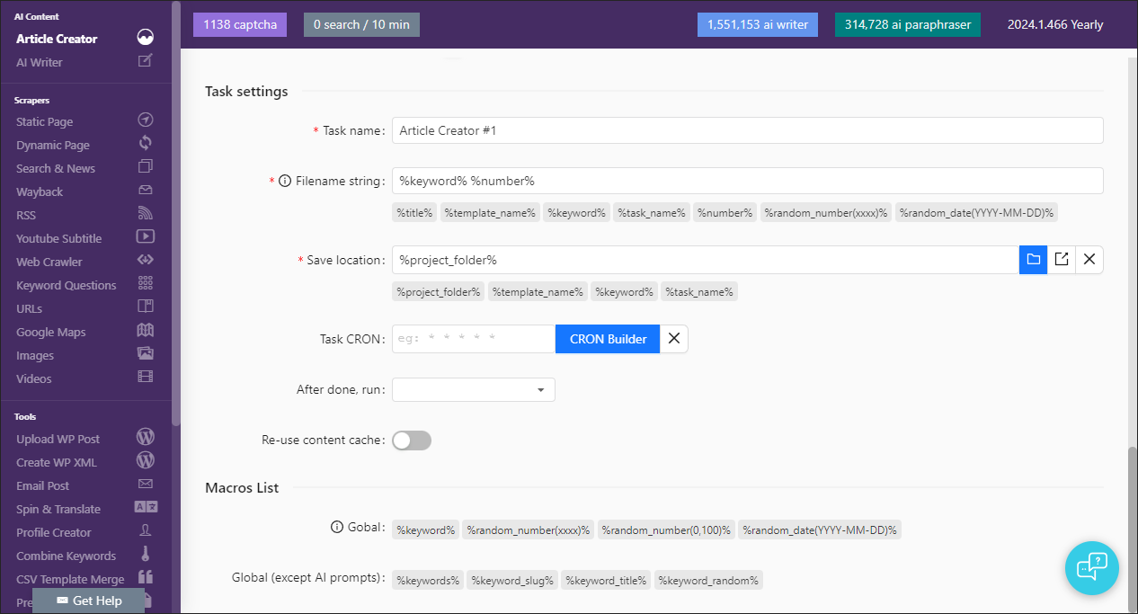
The first step is to update the Login page.
Moved some UI elements around.
If you don’t enter email or password you get instant notification of the form error.
The error message box looks a bit better.
Password box is has unhide button like most modern apps.
With nord update
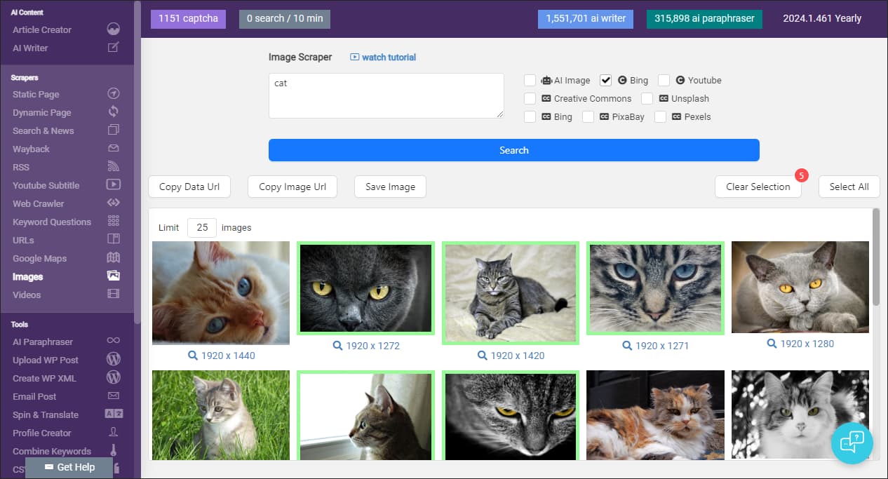
All buttons are updated. And when you click selection it gives a balloon counter now.
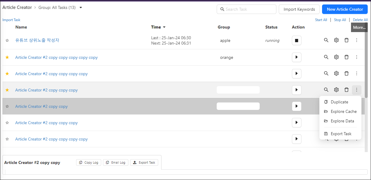
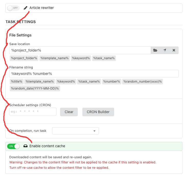
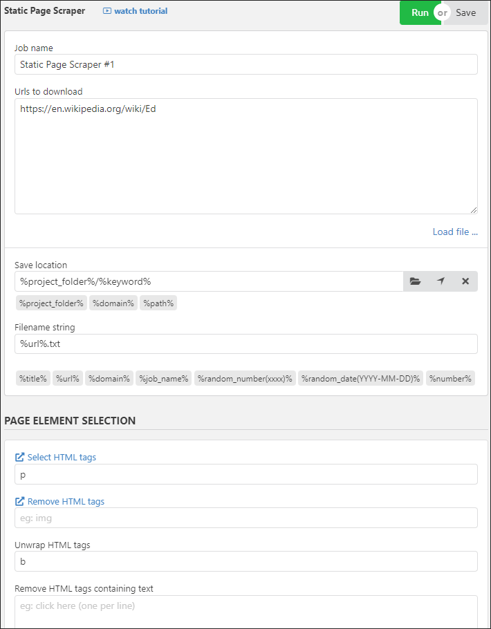
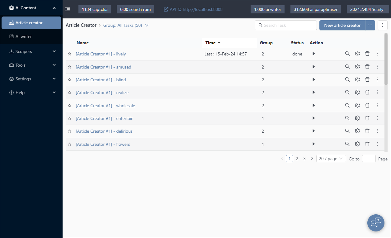
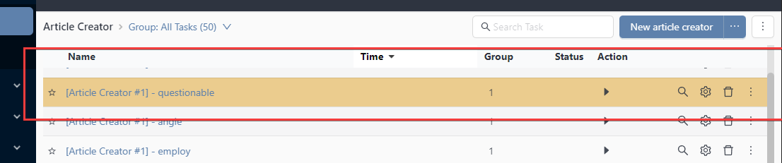
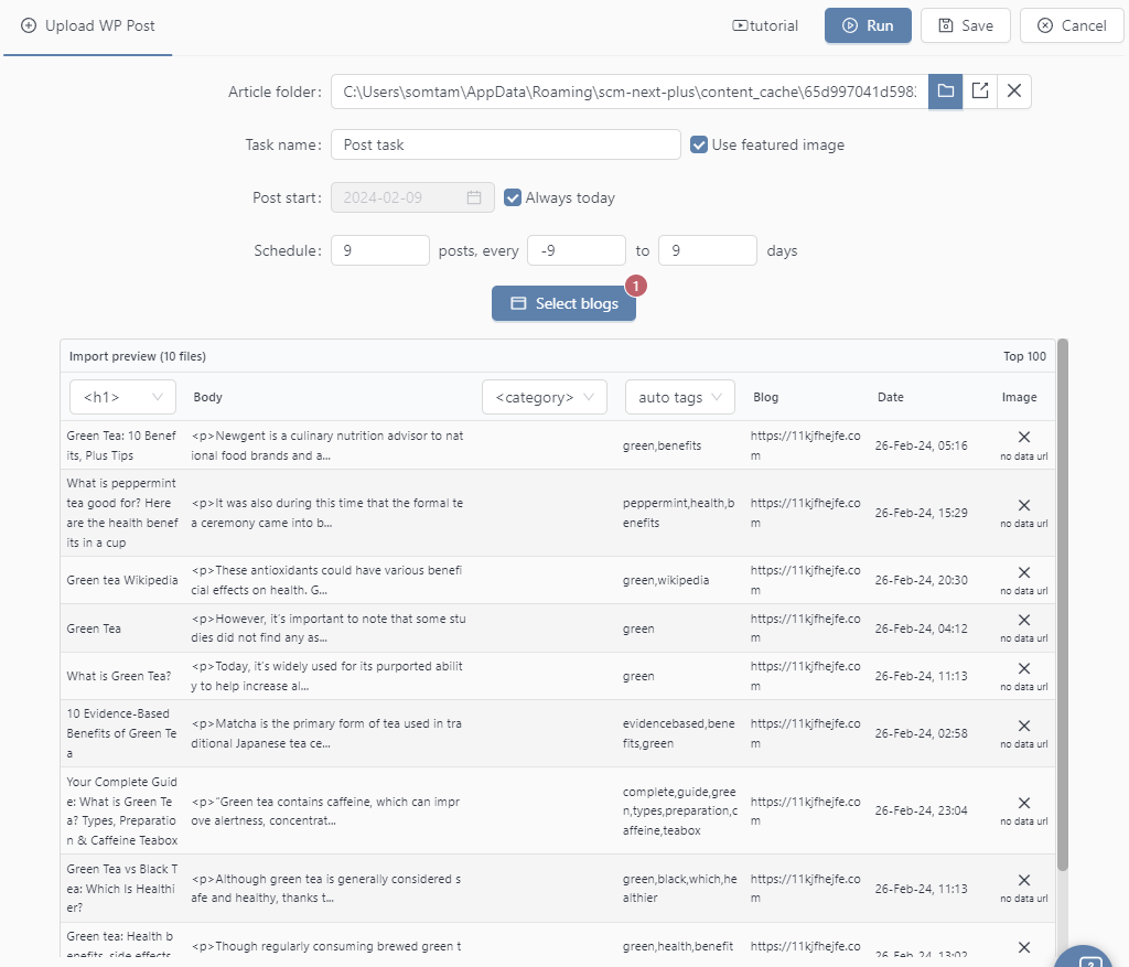
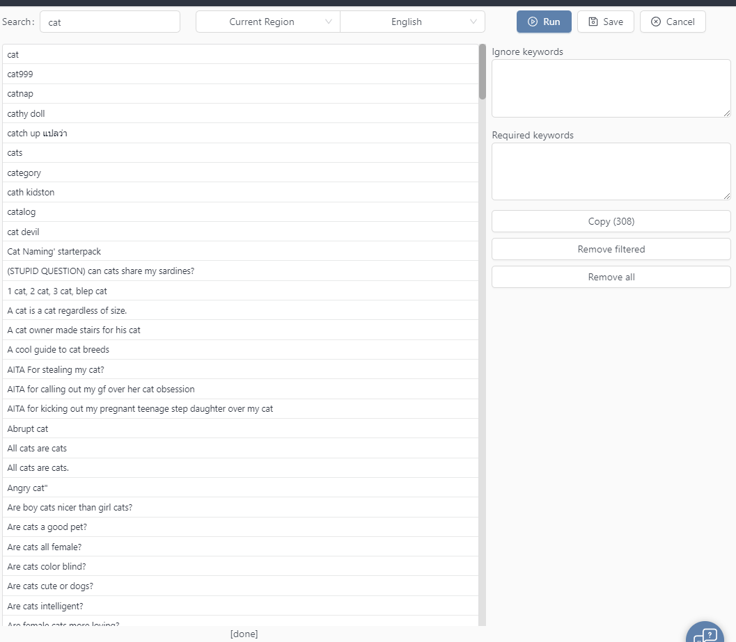
Updates to the task list table.
Screen shot of task list table getting a revamp.
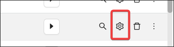
All tasks can be edited by clicking on the gear.
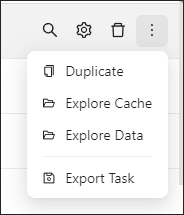
Some common task actions have been moved into the more button.
Cache/Button label has been removed.
When you want to preview your finish articles, a menu appears for additional actions.
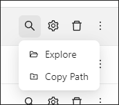
Lots of the old buttons was removed and placed into dropdowns to save space.
The goal is to have things laid out correctly even on a small 1280px width screen without wrapping of elements.
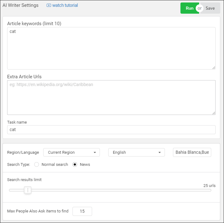
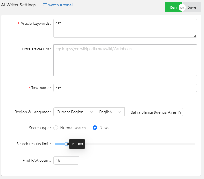
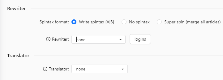
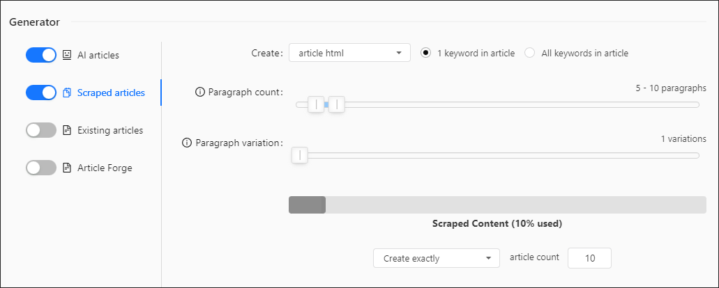
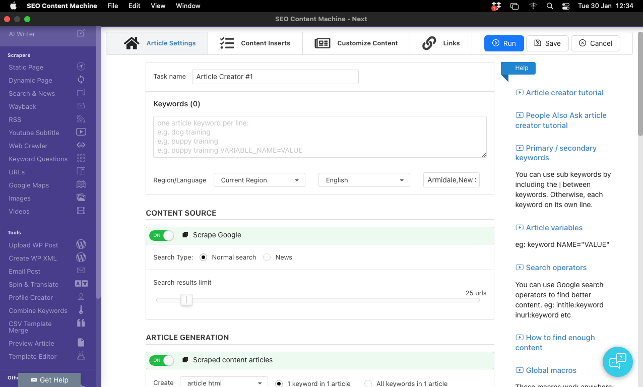
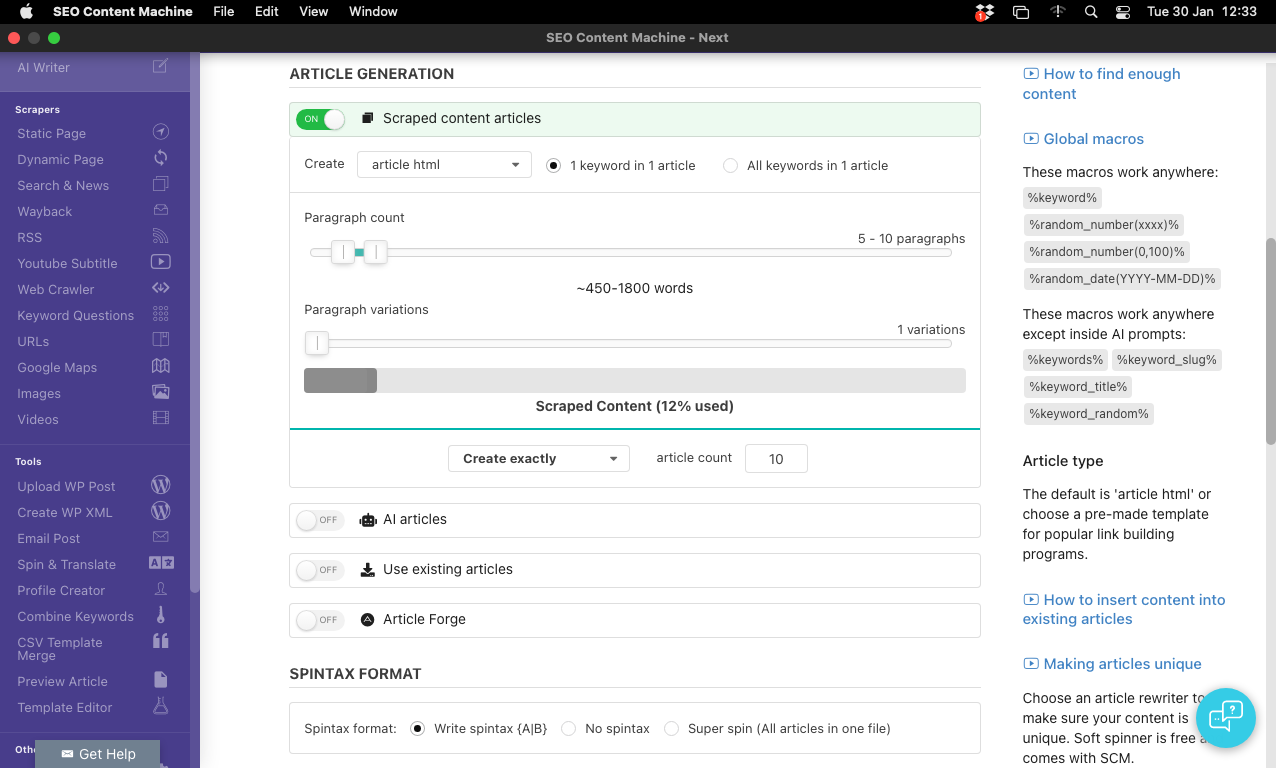
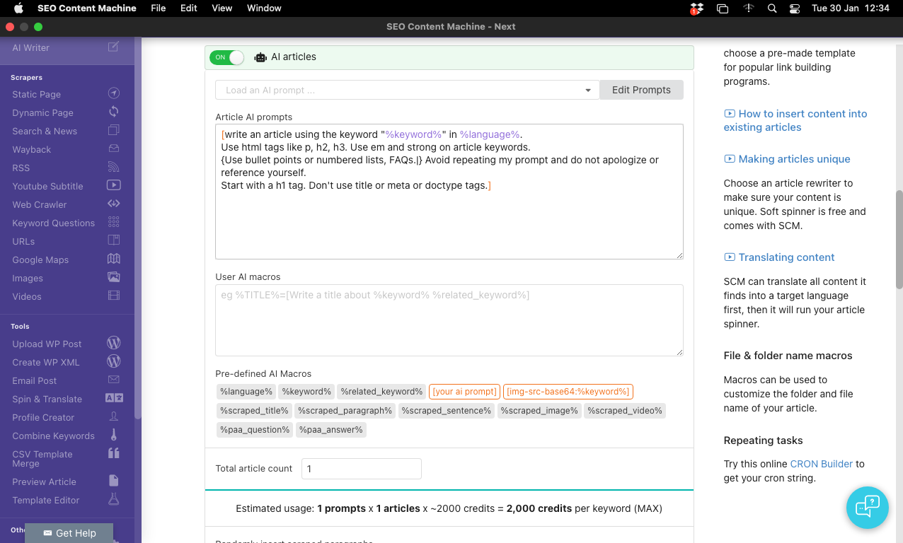
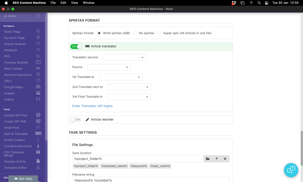
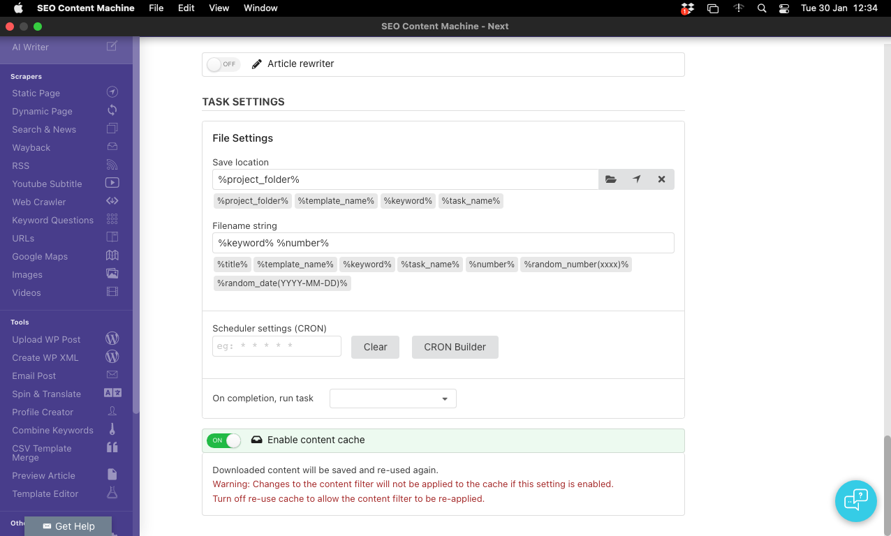
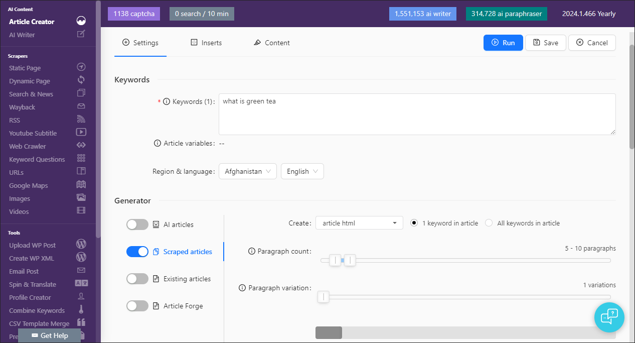
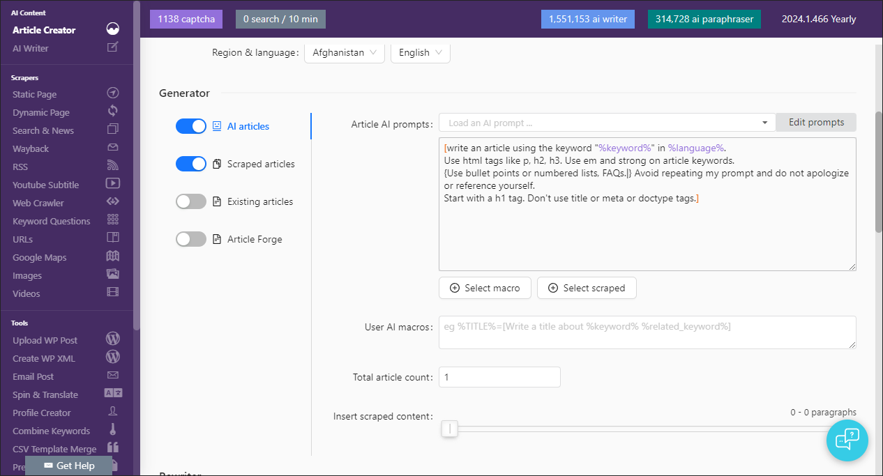
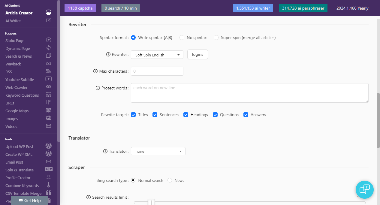
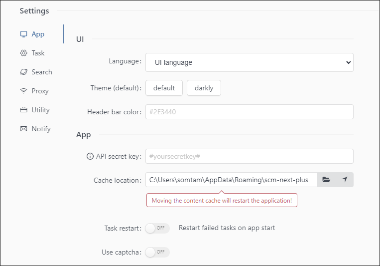
Article creator settings UI rework.
Removed extra toggles
Generation type is placed into tabs to take less vertical space.
You can see at glance how any items are enabled without scrolling down.
Unimportant settings moved to end of window
Most likely 3 headers tabs instead 4 in current SCM
Removed colors to simplify UI
Removed boxes and borders to create space
Help tab, all video links moved into tooltip (i) icons next to the property they are describing.
Aligned all setting labels so you can scan down the list easier instead of hunting for it in between input boxes
Colors! SCM is now using nord color palette to keep colors unified throughout the UI.
Less emphasis on color. Most buttons are white, only important primary buttons are colored.

All alert messages etc have been toned down as well.
The same colors are being used in the task log as well.
Lots of white space. However UI looks like this when its more busy.
This includes a new colored logo!
All inserts ported
If your screen height is too small, the inserts list collapses and has a hover over spot
The Insert list, selection and toggle is one UI element. No need to scroll down to find inserts. It all fits on one screen.
Old UI
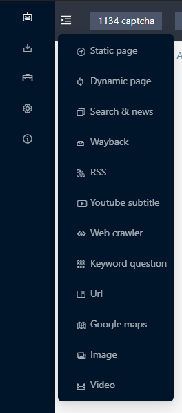
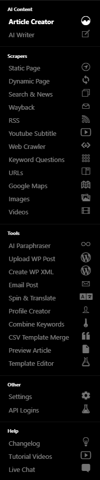
The sidebar has been reworked. Menu items slightly larger. Each section can be collapsed as well.
Sidebar can be made smaller with a toggle.
Collapsed menu, rollover items to see pop out menu.
On smaller screens this will you extra width so forms won’t wrap and task list rows will display all on one row.
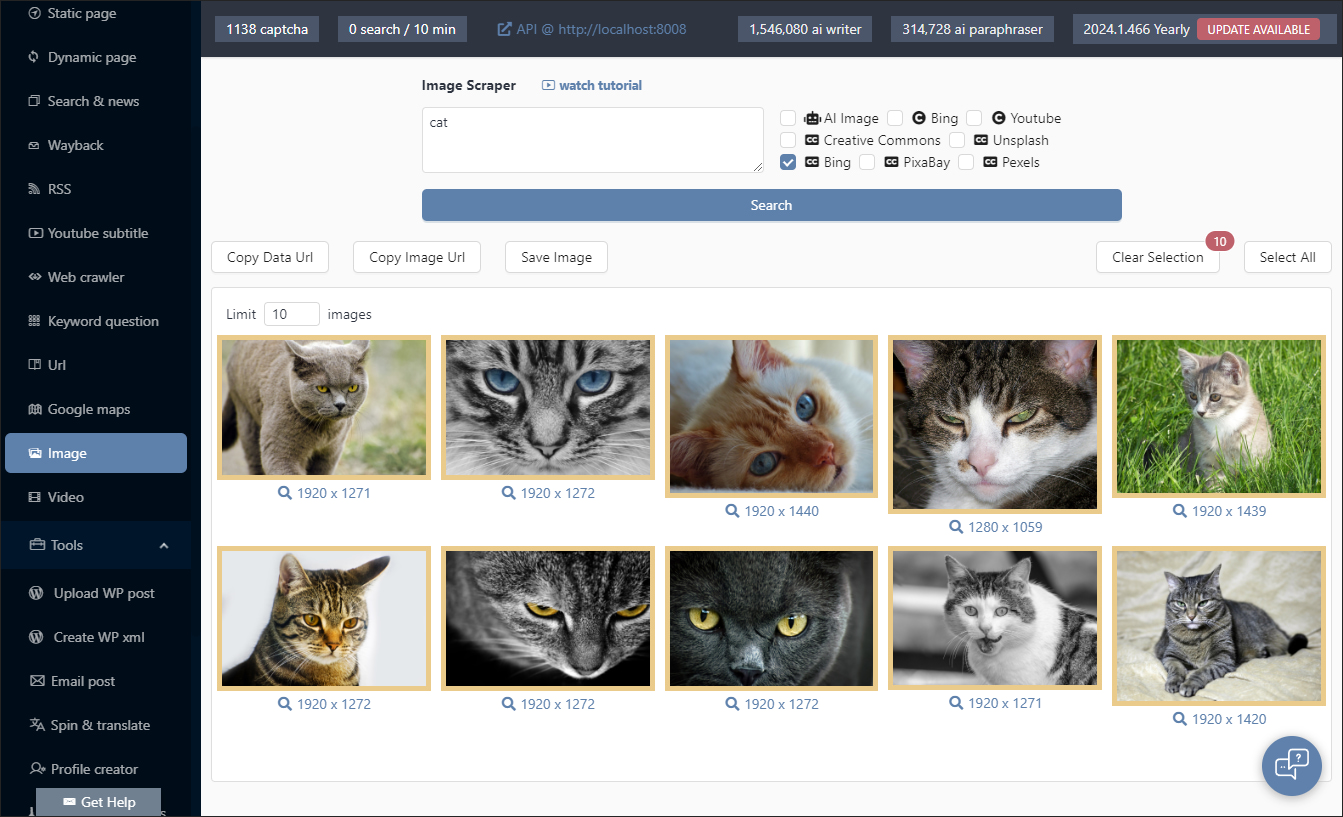
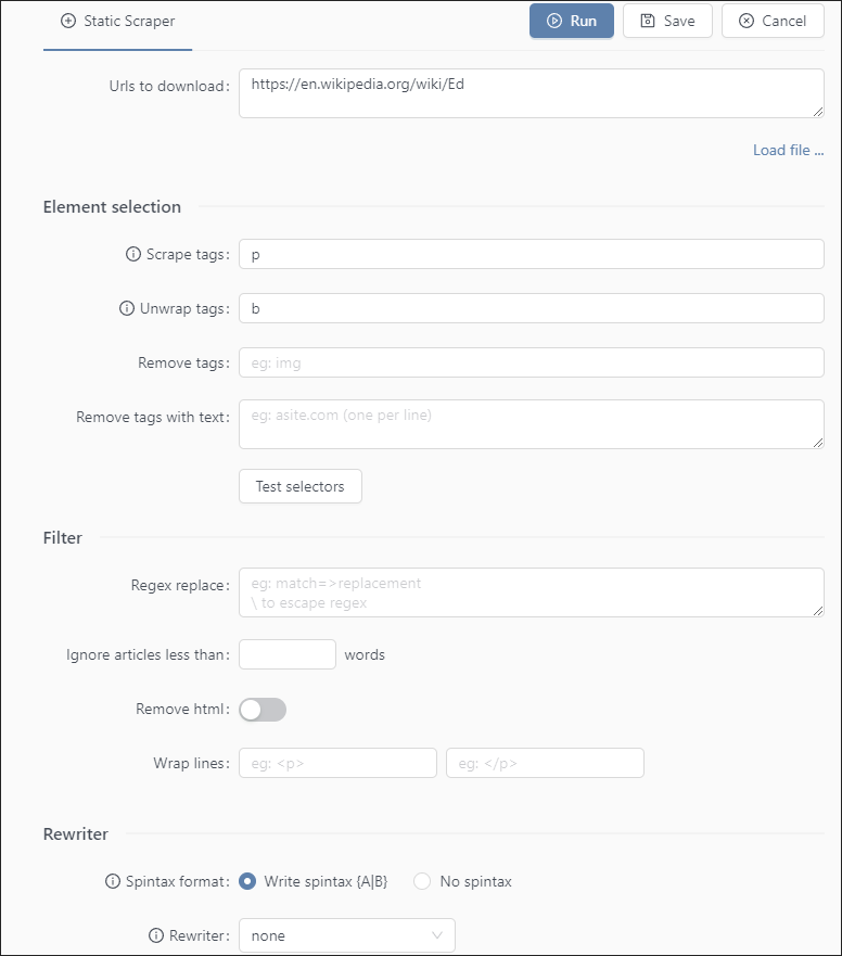
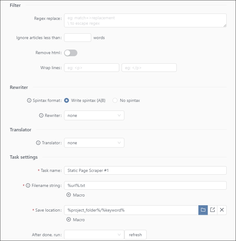
Search and news ported
All macro dropdowns will paste text into appropriate textbox for you.
You don’t need to paste it in yourself anymore.
Syntax highlighting brought over to article string.
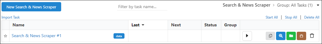
Infinite loading table for task table has been replaced with a paging element.
Improve performance on large lists, the table will show no more than 100 rows at a time.
Easier to get to end of table, no need to scroll down.
Now the task you are editing will flash ‘yellow’ briefly on save or run to confirm your edits.
App will remember your task table page and location even when you switch to a different task.
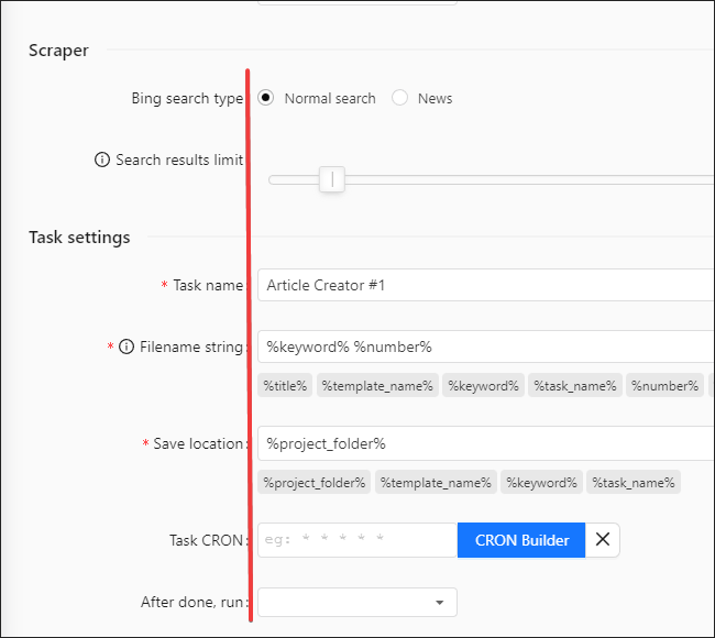
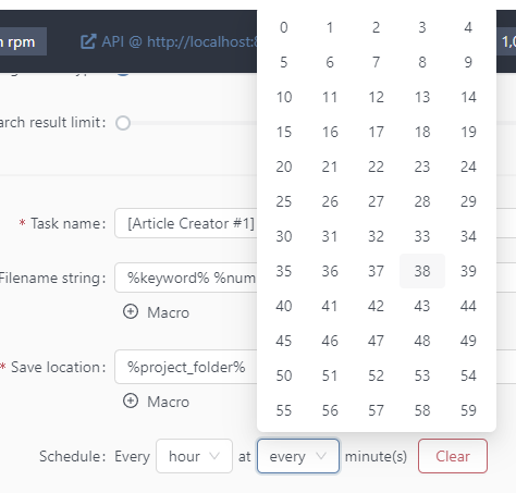
Task scheduler has been updated with an easier to use picker.
The process of running or scheduling your task has been updated as well.
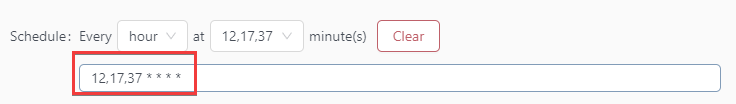
You can enter cron manually as well
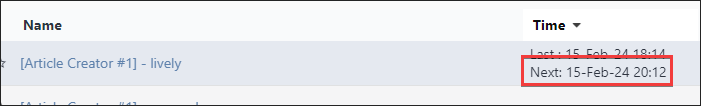
If you add cron and press ‘SAVE’ it will update the task immediately with the next run time.
It won’t run the task as well, just schedule it.
If you press RUN it will immediately run the task and also schedule it for later!
This replaces the old CRON box with a much easier to work with UI.
Profile creator + CSV merge has been ported.
CSV merge like all tasks now support both CRON and task chaining.