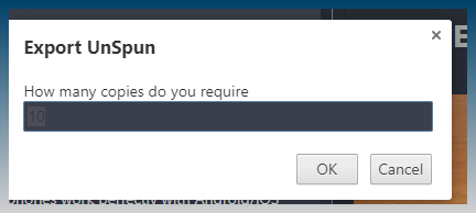
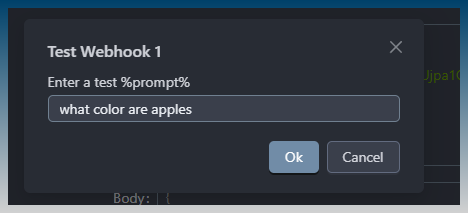
I’m currently doing adjustments to the default darkly theme.
Fixing up incorrectly colored boxes etc.
Most of the work being undertaken is to fix up visual inconsistencies, that show up really obviously on the darkly theme.
This requires porting the old UI code that still exists to use the newer UI style so that we go proper darkly theme support.
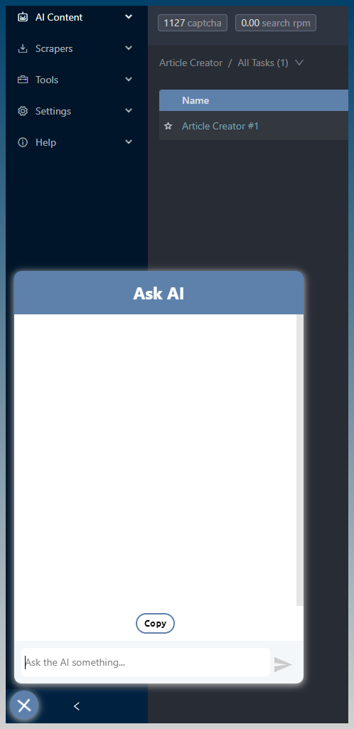
The ask ai button has been moved
It can even move position when you collapse the sidebar

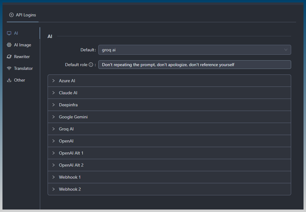
Some UI upgrades also, eg API logins
The app header bar has been re done

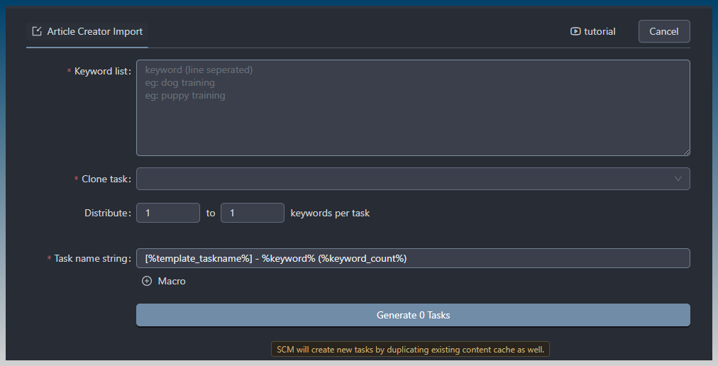
The article creator bulk import tool also got a remake
Some outstanding items are all the menu type headers eg, article preview
The rewrite menu bar in AI writer as well
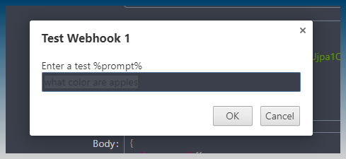
There are some input boxes that don’t support themes that need to be replaced
